|
Chinese internet culture is relatively young but is maturing with startling speed. In just a few years, Chinese web design has evolved greatly. However, English and Chinese websites are still substantially different, in more ways than just language. Chinese internet users like to browse through large amounts of information, both specific and related, available to them at once. Western internet users enjoy searching for what they are interested in. Without formats and functions that cater to the Chinese audience, many potential customers may leave the website, a severe waste of traffic. Customer habits and internet ecosystems unique in China heavily influence website designs and must be taken into consideration.
Design Differences
Navigation
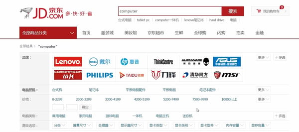
Western and Chinese web design do share some elements, for example, primary navigation options at the top of the page. However, Chinese websites tend to provide more options than Western websites. Menus offer general categories as well as shortcuts to popular specific topics. Secondly, for eCommerce websites which require more comprehensive structured navigation, although both Chinese and Western websites make use of collapsing submenus, Western submenus are typically organized vertically for further details while Chinese websites prefer it in horizontal rows. There is a similar preference when it comes to filters and attribute sorting settings – Chinese websites adopt horizontal design at the top of the page below the primary navigation bar, while Western websites favour sidebars, extending vertically down from left side of the page.
Example of primary navigation options in Chinese websites
www.sina.com.cn

Example of primary navigation options in Western websites
www.edition.cnn.com

Example of the filters and attribute options typically seen in Chinese websites
www.jd.com

Content structure
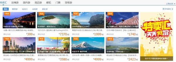
The ways that Chinese and Western websites structure content cater to their audiences differ respectively. Western websites tend to use whitespace and graphics liberally to direct attention. Page partitions are large and categorically sorted, allowing users to scan quickly. Chinese websites tend to fully utilize page space for content. Information is separated into smaller blocks so users can look through broader categories before deciding which one to further click and dive deep for details.
Example of the smaller, block page partitions in Chinese websites
www.ctrip.com

Page Length
Western website designs, particularly with the way their content is organized, typically make use of very long pages. Hyperlinks, rather than redirect to another page, often jump to tags within the same page. Chinese web designs produce pages that are shorter and more topic specific. Chinese website are usually 2 full screen lengths or less.
Colour
Western website designs are often minimalistic with the way colours are used. Contrast between content and page background is accented so that users can easily locate content in the whitespace. Chinese websites use colour in a different way. Chinese internet users like to see bright colours. Despite the emerging trend in Chinese web design for simplicity, Chinese people still prefer websites which are more informative and lively. Due to the amount of text and the density of content -partly also due to the nature of Chinese characters, important details are often coloured separately from the rest to differentiate.
Function Solutions
Merchandizing
Chinese transaction-enabled websites enhance brand image and generate additional conversion by offering diversified promotions. Content panes on attractive deals and events can be interacted with quickly. Most popular deals are the deal of the day, limited time only items, flash sales and group purchases. Websites also offer customer loyalty programs where prizes are given out for frequent business or where company points can be redeemed for rewards. These features encourage customers to return and check the website frequently for sales they may be interested in.
New Windows
Western websites typically open links in the same window. Users click back through the pages they browsed or start a new search altogether. Chinese websites operate differently, they open links in a new tab or window. This allows users to compare information between tabs or queue reading easily.
QR Codes
The mobile industry is hugely influential in China. Websites in China offer easy ways to interface with mobile devices. Many incorporate QR codes for various objectives:
- Encourage users to follow the company’s social account and allow quick logins
- Convenient way for users to download the mobile apps to drive adoptions of mobile apps
- Associated with online payment accounts for quick payments
Example of QR code display on website for users to download the mobile APPs
www.taobao.com

Online Chatting
Western websites often offer social media networking as well as direct email services. However, in China, websites typically offer a live chat options as Chinese customers like to inquire and receive information without delay.
Online Ecosystem
Search Engines
Google is unavailable in mainland China. The top Chinese search engines are Baidu, Sogou, So.com and Shenma. Websites need to be designed to be friendly to local search engines so that they can be crawled and indexed properly therefore building up authority online more effectively.
Although fundamental search algorithms are similar to Google, these are some pivotal properties of Chinese search engines for foreign digital marketers to adapt to:
- Chinese language websites are preferred
- Chinese websites with ICP licences and hosted locally are preferred further
- Local resources like inbound link and social resources are preferred
- For more details, read another blog post here.
Social Media
Due to the presence of the Great Firewall, services from Facebook, Twitter and other Western platforms are unavailable in China. Foreign businesses marketing in China should look to the Chinese replacements for these services like WeChat, Weibo instead. These social media platforms are also commonly used by Chinese websites as alternative registration and login methods. Chinese language websites of international companies need to provide links and alternative registration/logins to Chinese social media instead.
Online Payment
Alipay and Tenpay are the most popular online payment solutions in China, both for desktop and mobile. Both allow users to make payment with credit cards, debit cards, or their own wallets. For eCommerce and other transaction enabled websites, instead of integrating payment solutions popular in Western countries, such as PayPal or credit card, companies should adapt and integrate with Alipay and Tenpay instead.
Case Study: UTAS’ brand new digital marketing presence increases Chinese student recruitment by 44%
China, as the top source country for Australian universities, is the key target market for UTAS international students’ recruitment. UTAS recognise the importance of Chinese website design and worked with us to create a site specifically designed to meet the needs of Chinese students. Their attitude is “web first; everything else second.”
The new website showed a bounce rate decreased by 38%, and an average increase of 78% in browsing duration. With the new website design, additional online and offline marketing activities, the number of UTAS’ international students from China reached 44% YoY growth in 2016.
Let’s take a closer look at how we applied the principles of Chinese website design to create such an exciting result.
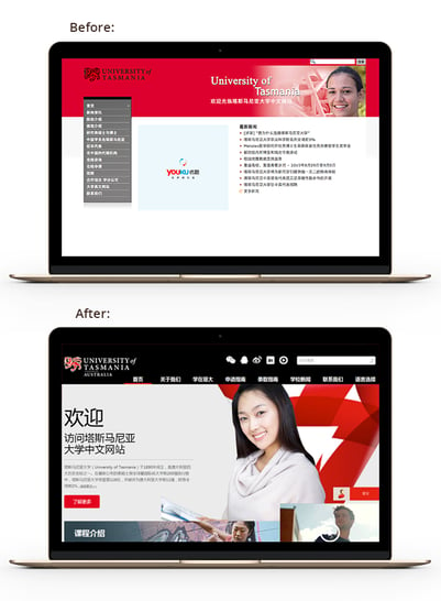
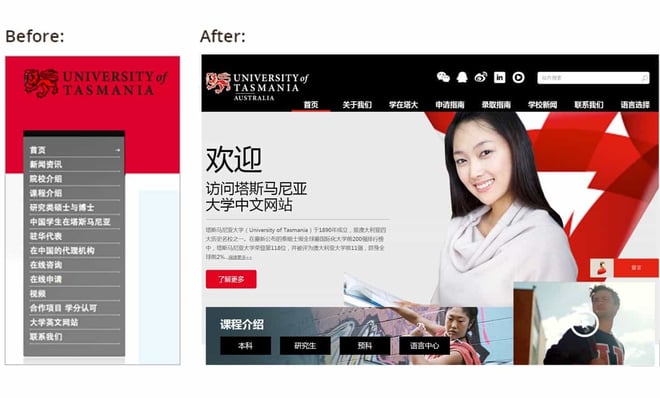
Comparison of website design between original and new website

Local host
Sites hosted outside China have very slow and unstable download speeds and offer a poor user experience. They also struggle to be found by Chinese search engines and are therefore not easily found by users, making it difficult for Chinese students to research universities. The UTAS site was designed for Chinese users and hosted locally for quick site loading, allowing them to quickly build a recognisable brand and establish their reputation.
Bespoke and inspirational website design
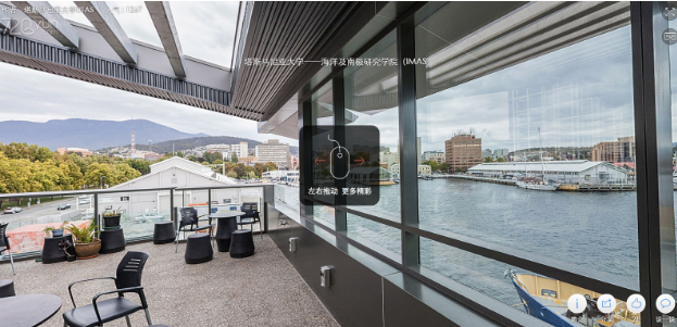
The bespoke design is built to support the Chinese user’s browsing habits. The original website is quite text heavy but the first impression of the new website is clean design reinforced by the use of a large hero picture to set the scene. The highly visual website reinforces the UTAS brand personality, which is fresh, young and welcoming. The site also incorporates lots of pictures and videos. Also important is the 360-degree panoramic picture which allows users to have a complete view of the area and gain an immediate feel for UTAS before he or she even reads a word.
Example of 360-degree panoramic picture

Restructured website to create a seamless user experience
The official university website is the key information channel for students and their parents who are researching overseas education opportunities, so it is important to customise the content and offer immediate answers to their questions.
The site navigation was simplified from a long sidebar menu to a concise horizontal text based menu that helps the user click to the right website page at a glance. In addition to this, website pages have been grouped and named with specific goals in mind so that users could easily dive into interest areas such as offered courses, admission guides and information about Tasmania as a study destination. In light of ever decreasing attention spans of digital consumers worldwide, making the navigation as intuitive as possible is paramount for effective conversion.
Comparison of navigation bar design between original and new website

Focus on audience engagement
The Chinese student relies on social media to source and share information, so we incorporated that into the website, adding a real-time Weibo update feed for students to understand what’s new about UTAS. The new website brings a much better engagement with students and their parents thanks to content integrated from social channels, where the current alumni share their stories.
Chinese language video is a vital part of the website and the university’s social media campaign. It provides a lot of information in easy to watch clips, and each clip links directly to the university’s website bringing a constant flow of targeted traffic.
Another feature included, in addition to the standard contact form to collect leads, is an online chat function which is always displayed in the bottom right corner of the screen to better address visitors’ inquiries. Chinese people like to have their questions answered quickly, so now visitors can submit questions anytime and anywhere on the site and get a prompt response.
Mobile-friendly design
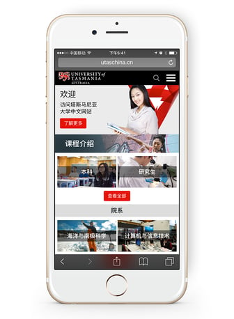
Although majority of users conduct online searches for schools via their desktop, there is an increasing trend towards the use of mobiles instead. So creating a mobile-friendly website to facilitate the decision making process of Chinese audience was a must for UTAS. Features such as a hamburger menu and visually clearly distinguished CTA buttons ensure a pleasant mobile browsing experience that’s easy on the eye - and the thumbs.
UTAS mobile-friendly website design

Adaptive to Chinese digital ecosystem
China has an unique online ecosystem and Western marketing techniques have proven ineffective. The UTAS site was designed to work effectively in the Chinese digital system, hosted locally and with content created in the Chinese language. It includes local social links, and is Chinese search engine friendly which boosts the opportunity to improve their search ranking. It places the UTAS site in front of the right audience to increase their chances of attracting more and more overseas students.
Friendly to Chinese search engines
Behind the scenes, the backend has been structured for maximum impact on search engines. SEO elements such as site and page titles, description and keywords are designed to be local search engine friendly. The structure works very well, and within half a month of launching, the UTAS website was indexed by Baidu, one of China’s main search engines. It has also been indexed by China’s other key search engines, Sogou and 360, building ranking authority quickly.
To enhance UTAS’ SEO ranking, we included content that not only introduced UTAS itself but also the local natural and human environment. This allowed us to incorporate more target keywords to drive better SEO results while offering useful information to researchers.
Local social links
Western businesses must adapt to local social media and video platforms to boost their success. So, from a functional perspective, we displayed UTAS WeChat, Weibo, QQ, Youku accounts with their respective QR codes on their website for visitors to easily browse and follow on their preferred channels. We encouraged them to follow UTAS’ official social media account to stay up to date on university news and QR codes enable quick login for fast updates.
Displayed UTAS local social links on the top of the homepage

Final words
Western businesses looking at marketing in China and tapping into the rapidly growing Chinese internet market must incorporate each of these key aspects of Chinese web design. By understanding what Chinese users are looking for and how they like to source and research their information, you will put your business in the right place and in the right format to be found.
|


