
Of the 731 million internet users in China, an astounding 695 million of them are on mobile. That’s 95 per cent of all internet users. Having a mobile-responsive website for China, therefore, is not just good practice – it’s an absolute necessity if you’re serious about breaking into the Chinese market.
In a nutshell, responsive web design is when websites are designed for a multitude of devices, from desktops to tablets and smartphones, with the content layout automatically adjusting to the various screen sizes. This provides an optimal user experience for the viewer, ensuring that no matter how websites are viewed, they remain appealing and easy to navigate. This is also important in terms of search engine optimisation (SEO), as mobile-friendly sites are ranked favourable by Chinese search engines, so that they appear higher in the search engine results page (SERP).
While some of the same principles that apply to Western mobile-responsive websites can also be applied to Chinese websites, there are some differences in terms of what is more appealing to a Chinese market.
Here are some of the best practices to consider when designing your mobile-responsive website for China.
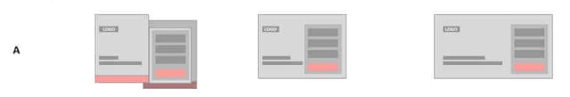
Page layout

The layout on the far-right of this image is an example of how a mobile-responsive site should look for devices between 1024 and 1920 pixels (desktops and large laptops).
As you can see, this layout adapts easily to devices between 641 and 1024 pixels (tablets and small laptops) by:
Reducing the spacing between the elements;
- Scaling down the size of page elements, such as images; and
- Wrapping text.
When scaled down further for devices under 640 pixels (mobile phones), the left-right layout becomes an up-down layout.
It is usually not necessary to adjust the font size of Chinese characters between devices, as this occurs automatically; however, you may need to adjust the font size for larger headings and textual design elements.
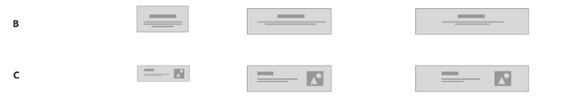
Navigation

Above is an example of how the navigation bar, which typically consists of a logo, menu items (e.g. Home, About Us, etc.), a search bar and perhaps a call-to-action (e.g. Contact Us), adjusts to various devices. For mobile versions, all of the items in the bar, with the exception of the search bar, are typically placed in a hamburger menu, accessed via a small icon with 3 parallel stripes.
To ensure your navigation bar remains highly responsive, here are some general rules to follow:
- If the menu items in the navigation bar are located on the right-hand side of the desktop version, then the hamburger menu on the mobile-responsive version should be placed on the right-hand side as well (see example A). If the menu items are located in the centre or to the left, then the hamburger menu should be located on the left (see examples B and C).
- The items in the hamburger menu can be aligned to the left or in the centre, regardless of the side of the screen the hamburger menu is located. However, a centre-alignment tends to only work visually if the menu items are of a similar length; if not, the menu can look disordered, making it more difficult to navigate. In most cases, we recommended using a left-aligned design, as this is much neater.
- The sequence of items in the hamburger menu should match that of the navigation bar in the desktop and tablet version. The items at the top of the menu should also be highly related to the homepage content.
- If the navigation bar of the desktop version doesn’t have many items or the text is very short, it may be better to keep the navigation bar on the mobile version as well, rather than folding/hiding them in a hamburger menu.
- Remove from the hamburger menu any content you want to specially emphasise or highlight on the tablet/mobile versions (such as social media icons or call-to-action items) and display them separately.
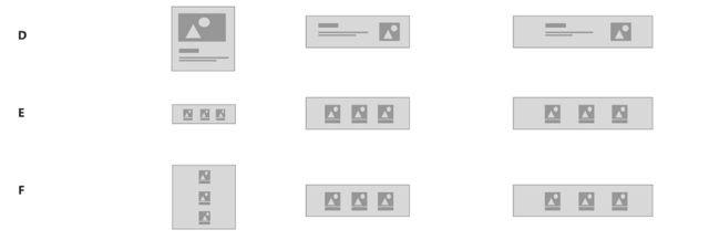
Website header
Your website header is important, as it’s the first visual impression a visitor encounters on the site. It typically consists of a large image and minimal text, and may describe a current offer or present a strong statement that represents your company’s offerings.

Example of a website header on Huawei’s website (desktop version)
In order to preserve the header’s impact on mobile, here are some guidelines to follow:
1. If there are forms or complicated functions incorporated on the website header on the desktop version, we recommend using pop-ups on the tablet and mobile versions to maintain the functional requirements on smaller screens (see example A below).
2. The background image of the header is generally adapted in one of two ways:
- The height of the image is kept uniform on all devices (see example B below).
- The image is scaled up or down, depending on the size of the device (see example C below).
3. For headers with images and text, there are two ways in which they can adapt to different devices:
a) Text displayed next to images in tablet and desktop versions appear underneath the image in the mobile version (see example D below). Similarly, images displayed horizontally alongside each other in the tablet and desktop version appear vertically on the mobile version (see example F below).
b) Both the text and images are scaled proportionately to the device (see example C and E below).
Social media icons
Social media is a crucial aspect when it comes to digital marketing in China, so it’s important to ensure your social media accounts are displayed prominently somewhere on the site. Depending on the website, social media icons can be displayed in different locations, such as within a hamburger menu or directly on the homepage.
In general, social media icons are displayed at the bottom of the webpage, in order to attract visitors to follow the account. (Typically, a visitor will decide whether or not to follow the account only after browsing the contents of the entire homepage.) WeChat icons are usually displayed with a QR code, as well as the account name. Weibo and Youku accounts are usually displayed with the account name and a hyperlink to Weibo or Youku official account page.
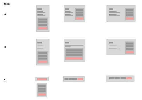
Landing pages and forms
Landing pages are your biggest assets in terms of collecting leads, so you need to ensure these perform well on all devices.
Typically, on the desktop version of the site, the form appears on the right-hand side. When adapted for the mobile version, the left-right layout becomes an up-down layout, and the width of the form is shrunk (see examples A and B). When adapted for the tablet version, either a left-right (example A) or up-down (example B) layout can be used.
Some forms can also be changed to a button with a pop-up function that displays the form in detail (see example c).
Images and text
Website components that combine images with text are typically used to display products, as you can see in the example below, though they can also be used to present information, such as news.

These components are generally adapted in one of four ways when it comes to mobile-responsive sites:
1. The left-right layout on the desktop version becomes an up-down or grid layout for tablet and mobile versions (see examples A, B and C).
2. The components (both the image and text) are scaled up or down in their entirety, depending on the size of the device (see example A).
3. The layout of the components themselves changes from an up-down to a left-right layout (see example B) or vice versa.
4. Only the images are scaled up and down, depending on the size of the device, while the text size remains unchanged (see example B). The display area is also decreased.

Providing users with the best experience possible
As you can see, there are several things to consider when designing a mobile-responsive site, and often several different ways to go about solving a problem. When trying to decide which is the best route, always put yourself in the shoes of your users. Some questions to ask yourself might include:
What information is most important them?
Be mindful of what appears ‘above the fold’, and make sure you are always putting your best foot forward. Try not to bury important information too far down either, as it can be frustrating for users to have to scroll through several pages to find what they are looking for.
How can you display that information in a way that is most appealing?
Do the images and text need to be of a reasonable size, so users can see the details more clearly, or is it more important to get as many products on the screen as possible, so users can easily compare them?
How can you retain the functionality of your site, while also ensuring it continues to perform well between devices?
Are annoying pop-ups detracting from the experience? Are fancy effects making the page load too slowly on mobile or tablet versions? Be sure you are delivering what users actually want out of your website first, before adding any other extraneous features.
By placing your user at the heart of your decision-making, you can ensure that you are giving them the best experience possible.


